Human Resource Management System (UI/UX Case Study)

The HRMS (Human Resource Management System) is a digital platform designed to streamline and simplify employee management processes within an organization. This UI/UX case study focuses on creating an intuitive, role-based experience that enhances usability, clarity, and efficiency for all users.

View work

Bringing Clarity to Care: A Real-Time Healthcare Dashboard

I designed a real-time healthcare dashboard to help clinicians monitor patients efficiently and respond to critical conditions with confidence. The solution brings vital data, alerts, and patient history into one clear, actionable view.

View work

Cultivate Connect

Indoor Farming Management Application (UI/UX Case Study)

view work

Service Booking & Discovery Mobile App

This project focuses on designing a service discovery and booking mobile app that helps users easily find and select essential services. The goal was to create a simple, personalized onboarding experience that reduces effort and improves usability.

view work

Human Resource Management System (UI/UX Case Study)

Objectives

The primary objective of this project was to design a clear and intuitive user interface that simplifies complex HR workflows and reduces cognitive load for users. Special focus was placed on creating role-based experiences for HR managers, administrators, and employees, ensuring that each user can complete their tasks efficiently without unnecessary complexity.

Another key objective was to improve navigation and information hierarchy so users can access important features quickly and effortlessly. The project also aimed to maintain strong visual consistency through a structured and scalable design system while enhancing overall usability and accessibility to deliver a smooth and inclusive user experience.

Problem Statement

Many existing HRMS platforms suffer from cluttered interfaces, complex navigation, and poor information hierarchy, making routine HR tasks time-consuming and frustrating for users. HR managers often struggle to access critical employee data quickly, while employees find it difficult to complete simple actions such as applying for leave or viewing payroll information.

From a user experience perspective, the lack of role-based design leads to unnecessary features being shown to all users, increasing cognitive load and reducing efficiency. This project aims to address these usability issues by redesigning the HRMS interface with a strong focus on clarity, simplicity, and task-oriented workflows tailored to different user roles.

Target Users

The HRMS platform is designed to serve multiple user groups within an organization, each with distinct goals and responsibilities. Understanding these users was essential to creating a role-based and efficient user experience.

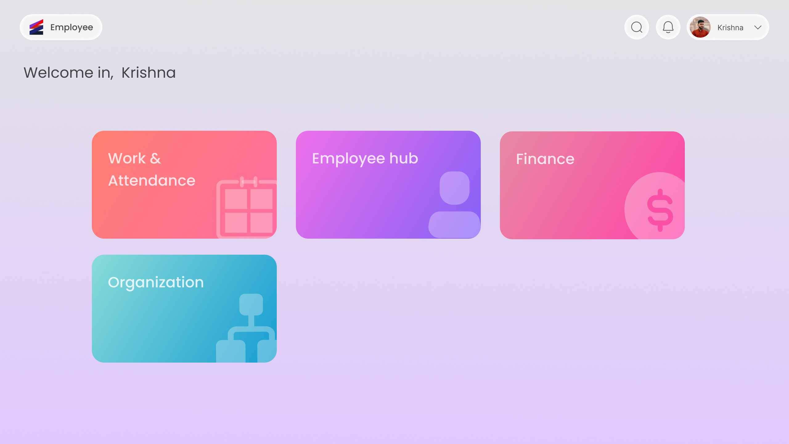
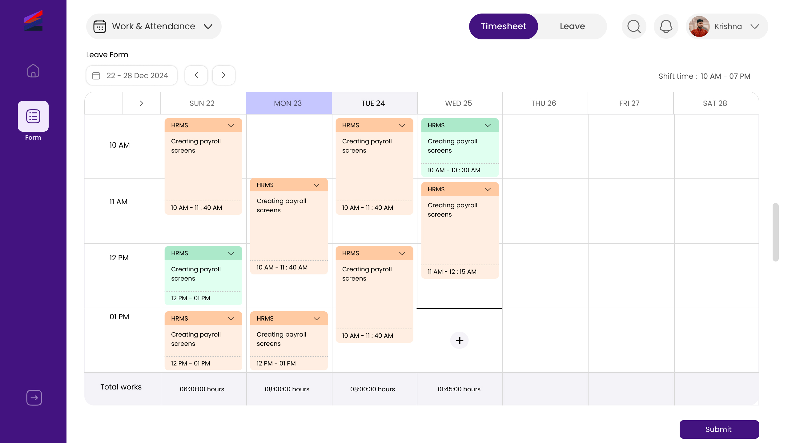
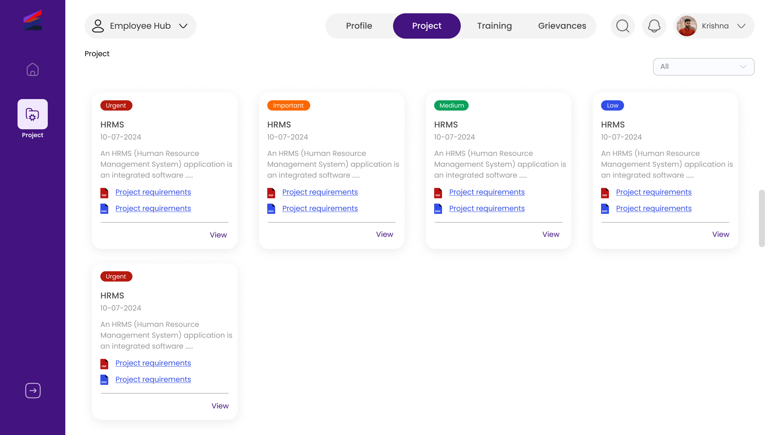
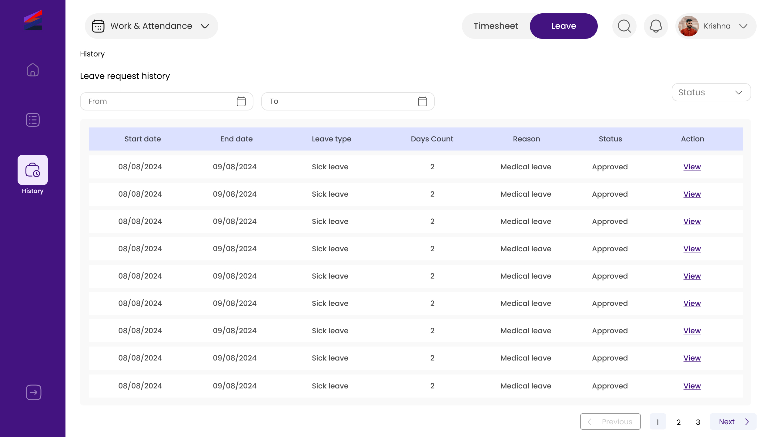
The primary users include HR Managers, who need quick access to employee records, attendance, payroll, and reports to manage organizational operations efficiently. Employees are another key user group, requiring a simple and accessible interface to apply for leave, view personal details, and track attendance without confusion. Administrators support the system by managing permissions, configurations, and overall platform stability.

Designing with these users in mind ensured that each role receives a focused interface with only the most relevant features, reducing complexity and improving usability.

User Research

User research was conducted to understand the real challenges faced by HR professionals and employees while using existing HR management systems. The research focused on identifying common pain points, usability issues, and expectations from an ideal HRMS interface.

Insights were gathered through informal interviews, observation of existing HR platforms, and competitive analysis. The research revealed that users often feel overwhelmed by crowded dashboards, unclear navigation, and repetitive steps for simple tasks. These findings guided the design decisions and helped prioritize simplicity, clarity, and task-focused workflows throughout the design process.

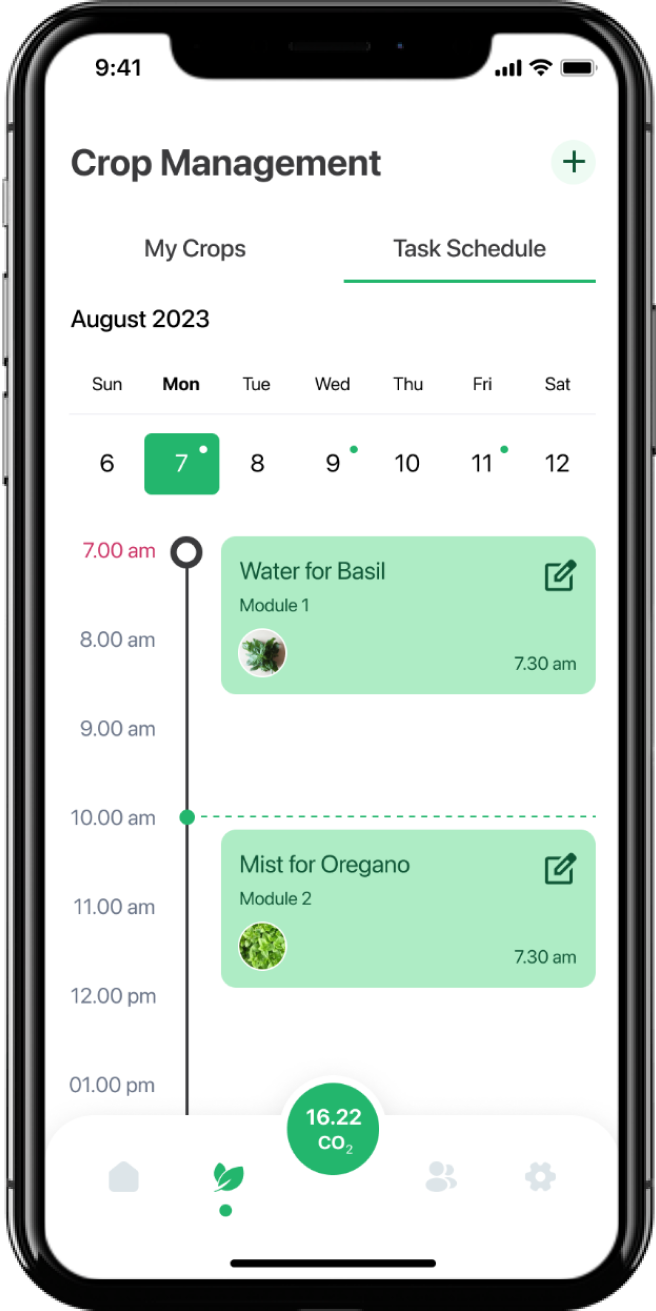
User Journey & Experience Flow

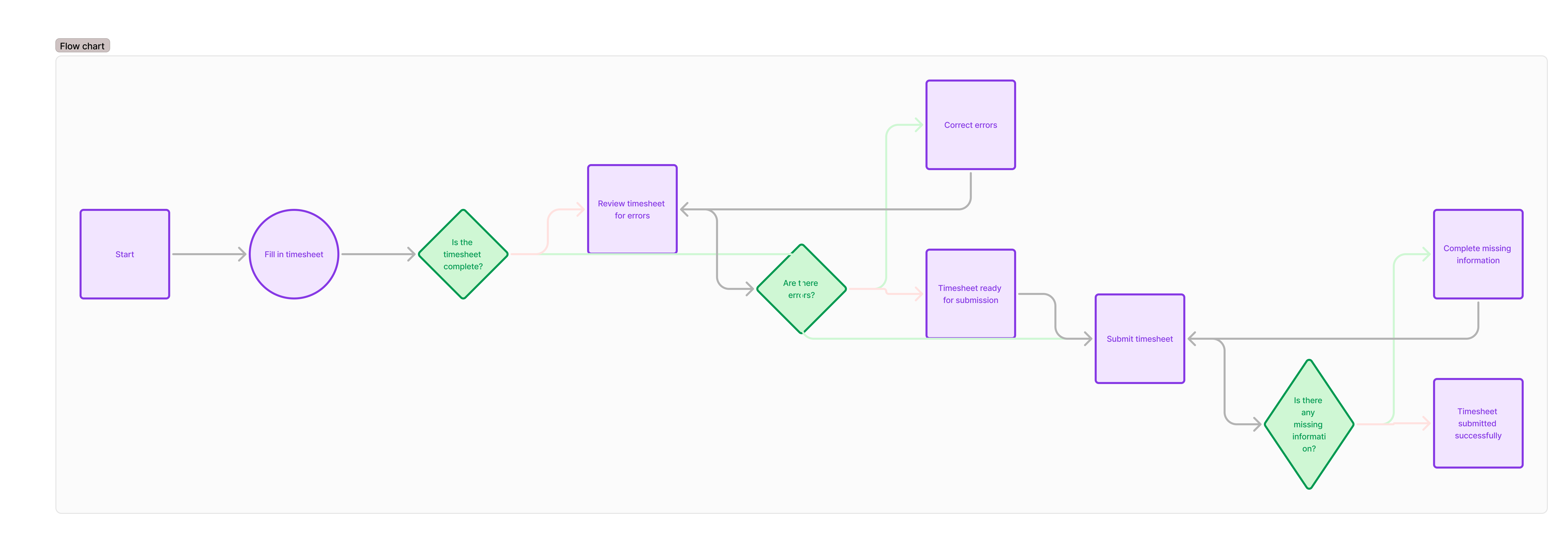
Based on the research insights, user journeys were mapped to understand how different users interact with the HRMS platform to complete their tasks. This helped identify friction points, unnecessary steps, and opportunities to simplify the overall experience.

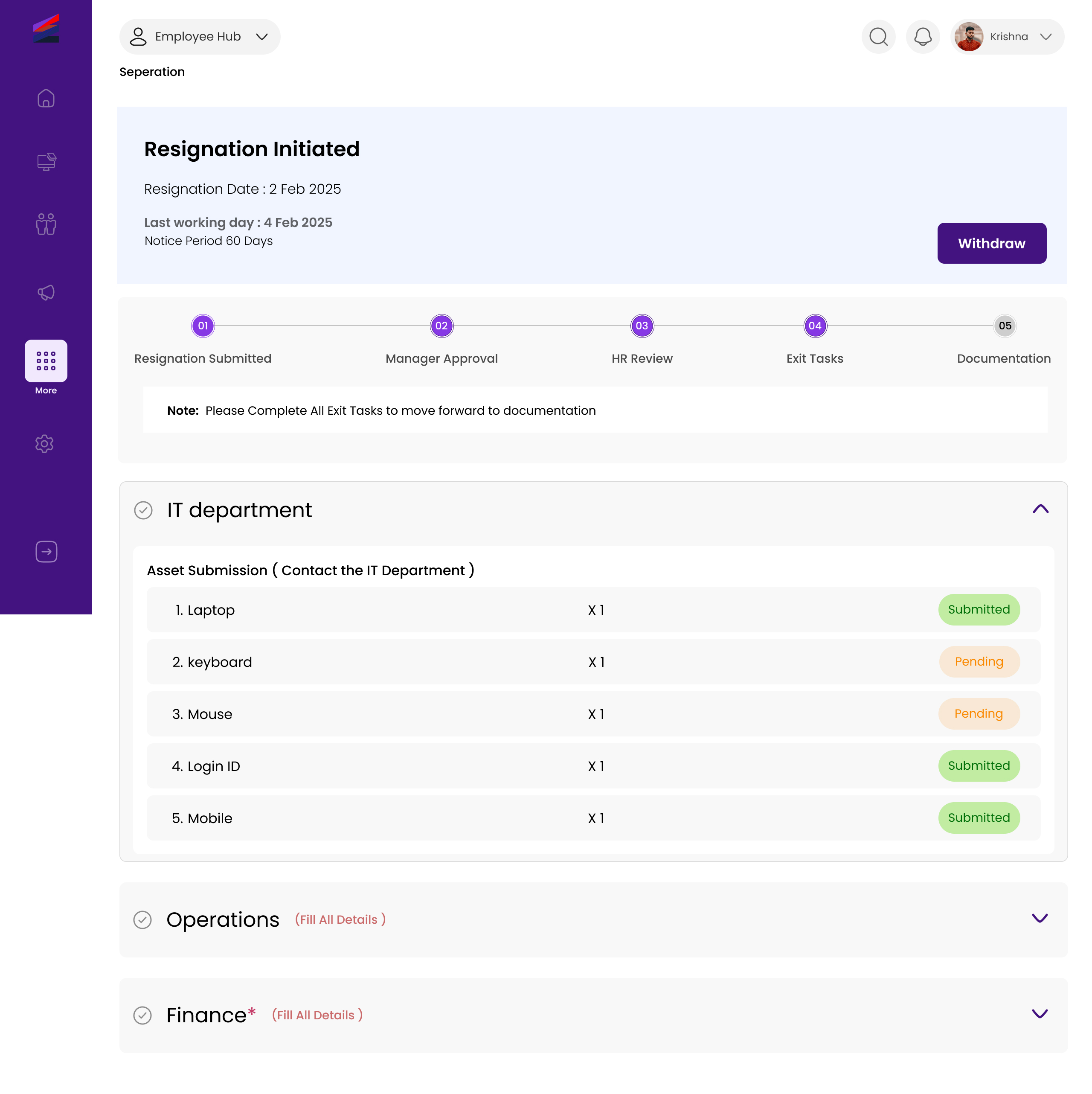
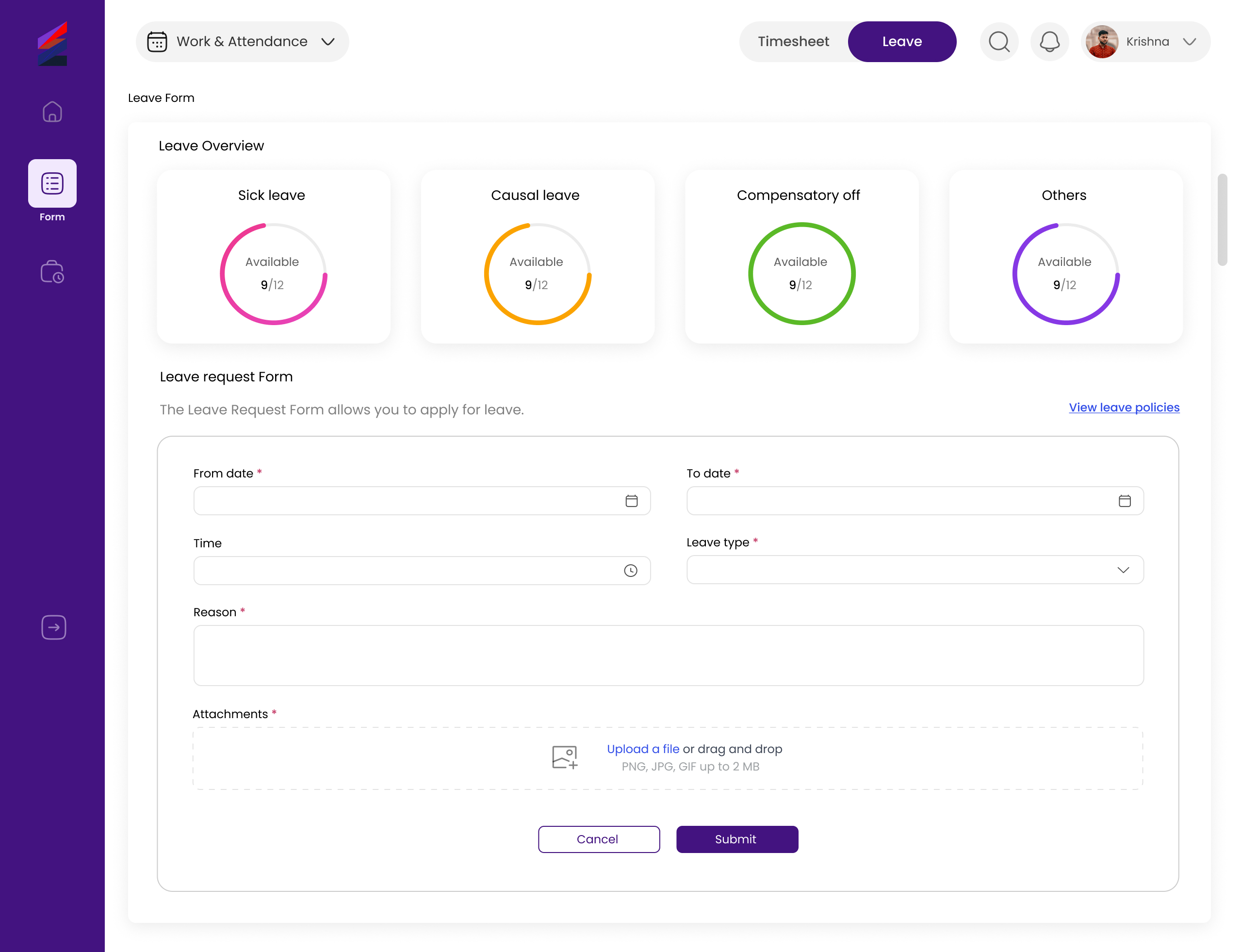
Clear task flows were created for key actions such as employee onboarding, leave application, attendance tracking, and profile management. By visualizing each step from the user’s perspective, the design ensures smooth transitions, logical navigation, and a more efficient experience tailored to each user role.
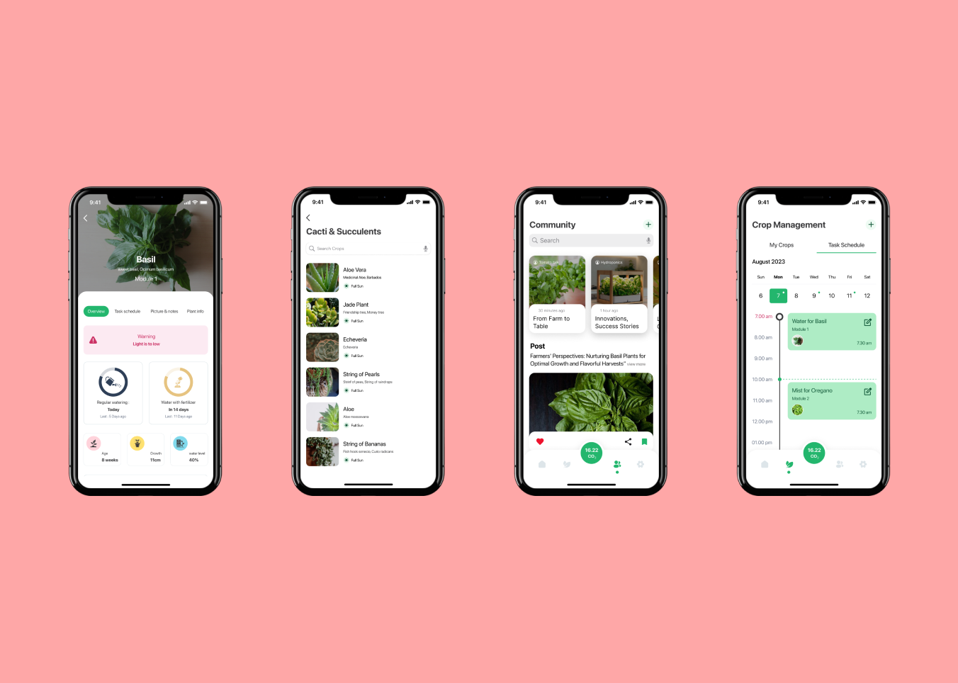
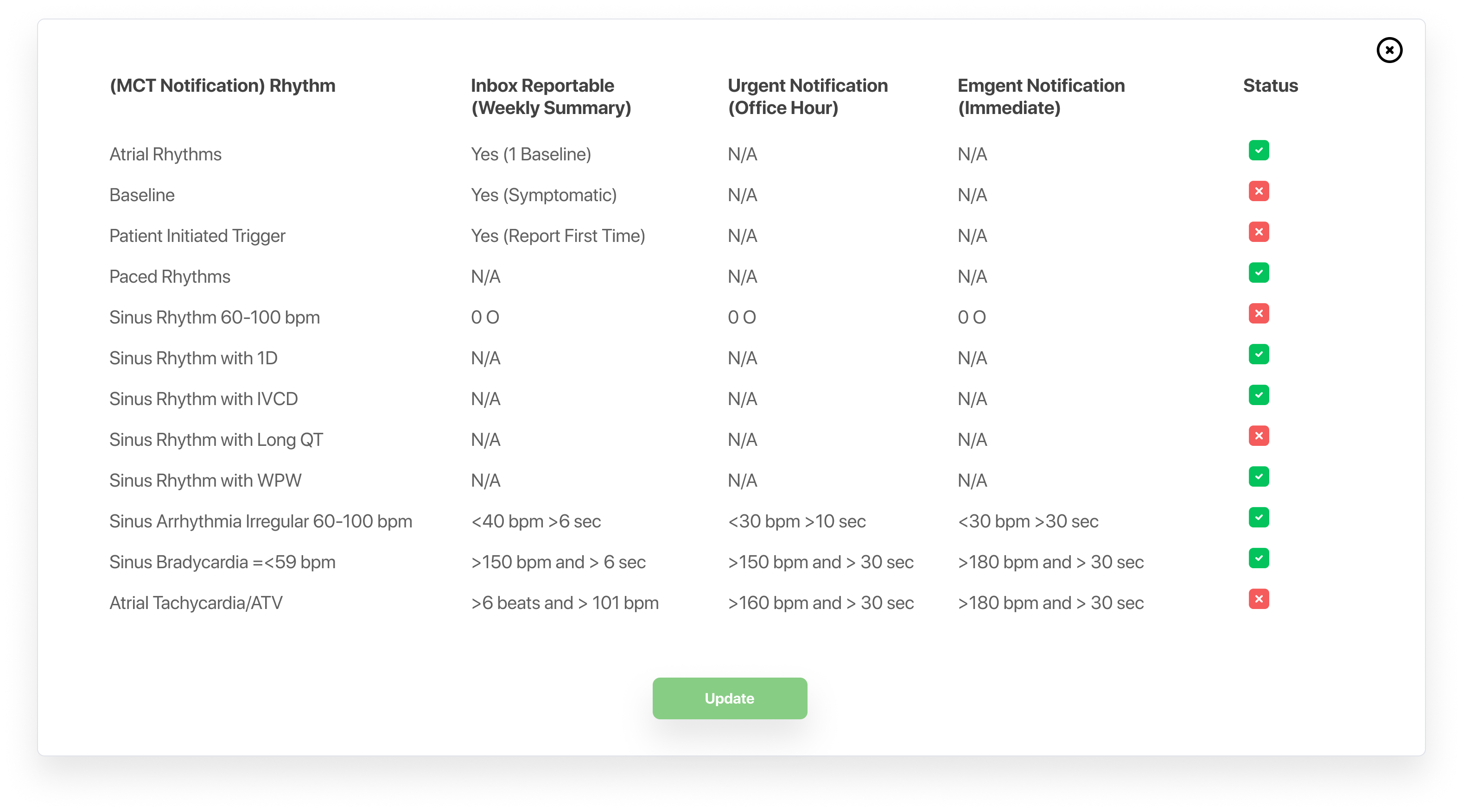
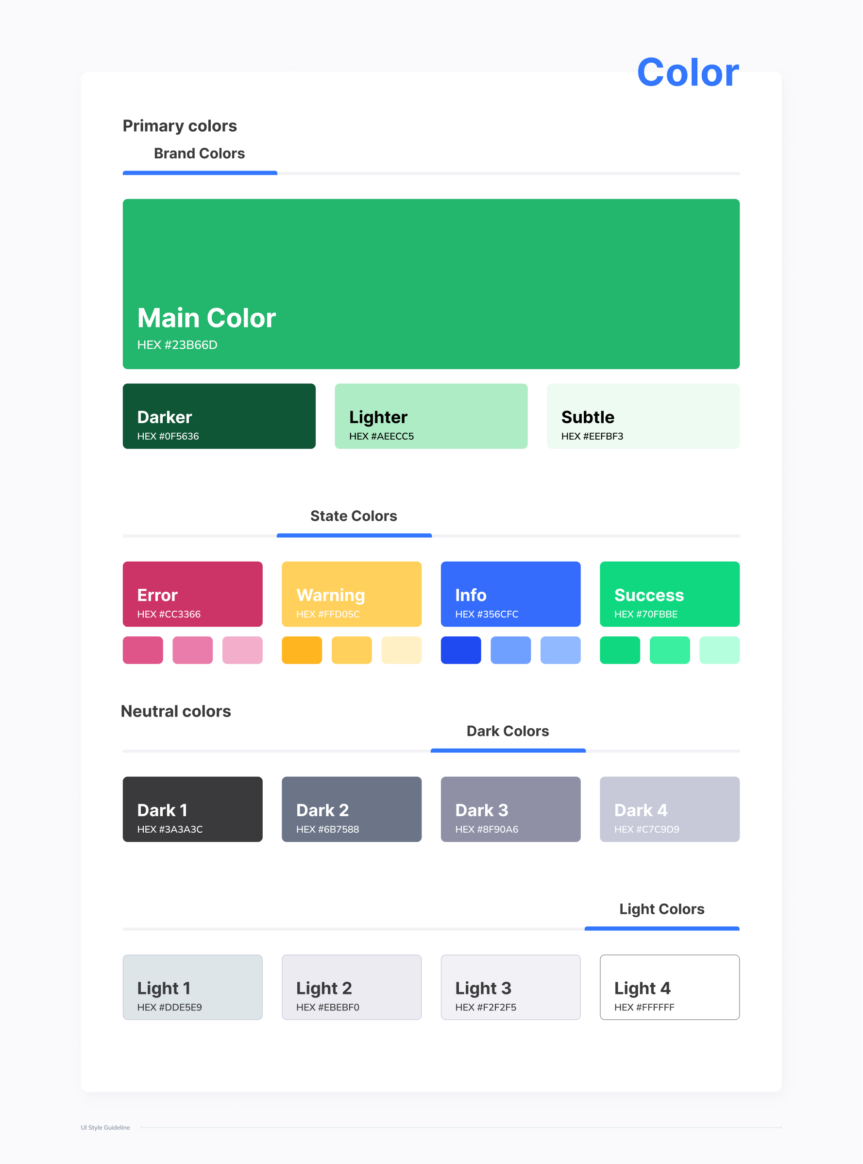
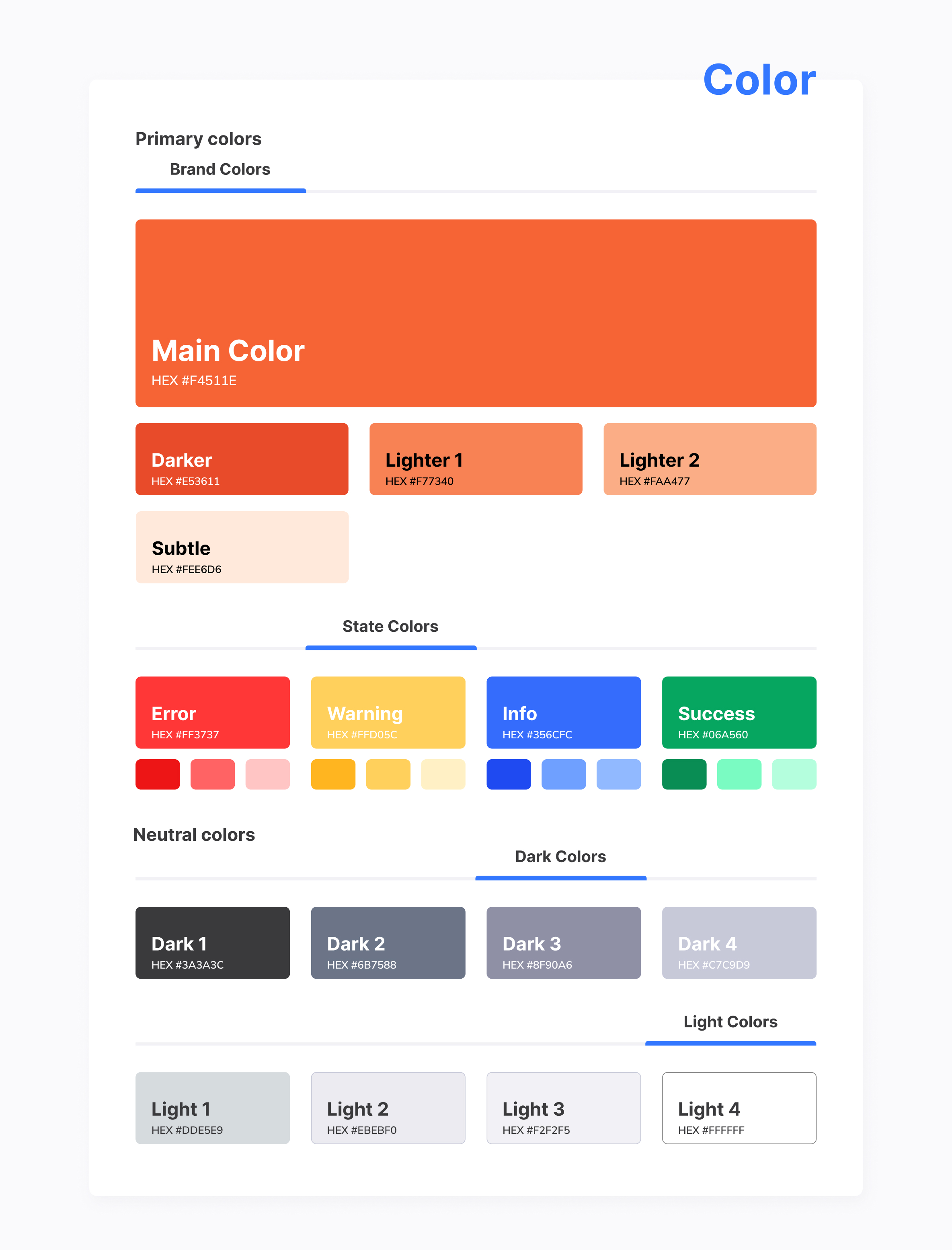
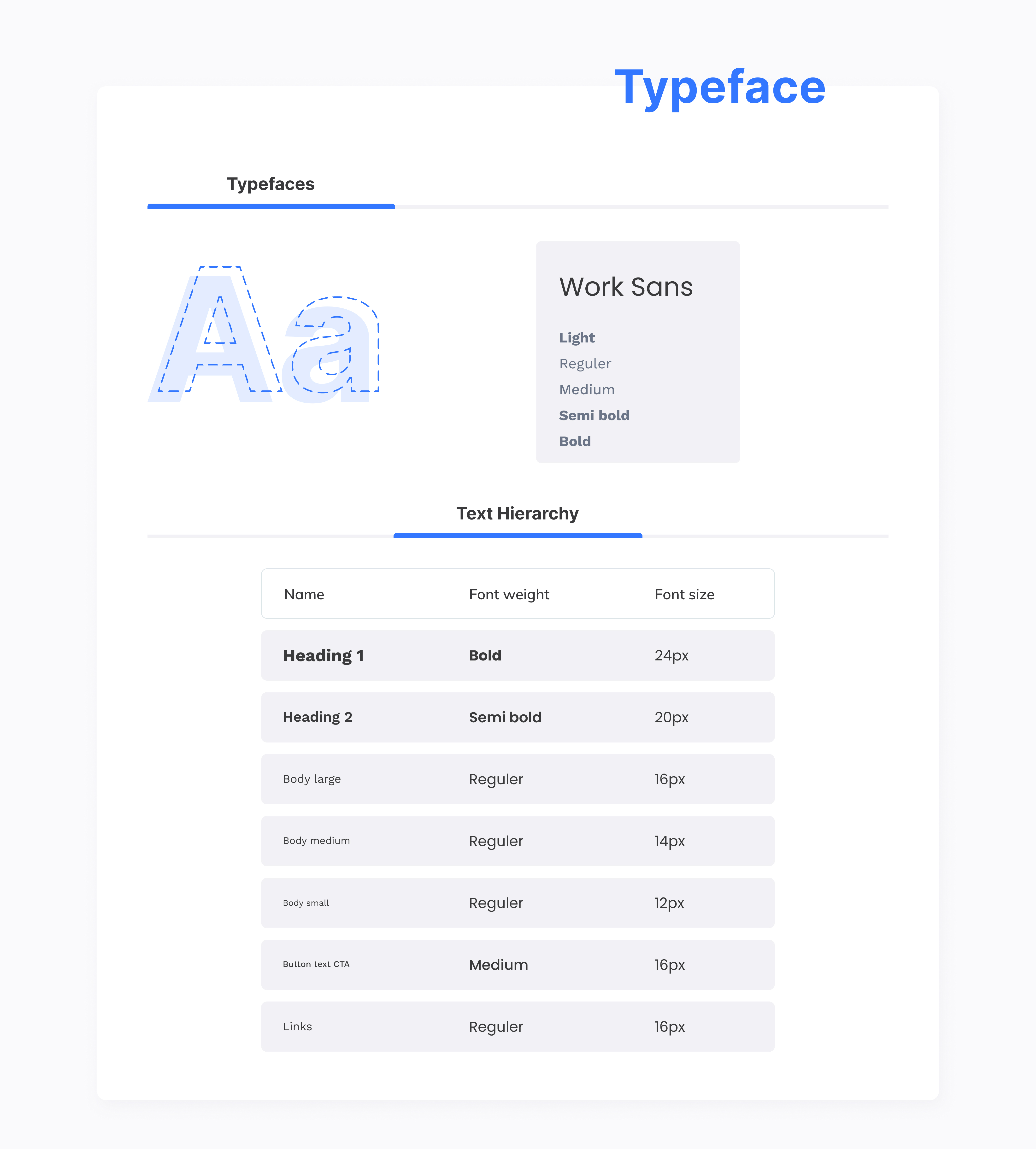
Visual Design

The visual design of the HRMS interface focuses on creating a clean, professional, and minimal look that supports usability and reduces visual clutter. The design prioritizes clarity through proper spacing, alignment, and a strong visual hierarchy, ensuring that users can easily scan and understand information.

A consistent color palette and typography system were used to establish a trustworthy and modern feel, suitable for an enterprise application. UI components such as buttons, cards, tables, and forms were designed to maintain consistency across all screens, helping users build familiarity and confidence while navigating the system.

Usability & Accessibility Considerations

Usability and accessibility were key priorities throughout the design of the HRMS interface. The layouts were designed with clear visual hierarchy, readable typography, and consistent interactions to ensure users can complete tasks with minimal effort and confusion.

Accessibility considerations such as sufficient color contrast, clear labels, and easily distinguishable

Learnings & Takeaways

This project provided valuable insights into designing enterprise-level applications with multiple user roles and complex workflows. It strengthened my ability to think from a user-centered perspective, balance functionality with simplicity, and design interfaces that support efficiency and clarity.

Through this case study, I improved my skills in information hierarchy, layout structuring, and visual consistency. The project also reinforced the importance of understanding user needs early in the design process and translating them into intuitive, scalable design solutions.

Bringing Clarity to Care: A Real-Time Healthcare Dashboard

I designed a real-time healthcare dashboard to help clinicians monitor patients efficiently and respond to critical conditions with confidence. The solution brings vital data, alerts, and patient history into one clear, actionable view.

Role
UI/UX Designer
Time
2 months
Team
2 people
Industry
Healthcare

Overview

Background

The Healthcare Dashboard was designed to support doctors, nurses, and administrative staff by bringing fragmented patient data into a single, intuitive interface. The dashboard provides real-time patient vitals, urgent alerts, and comprehensive patient profiles, allowing healthcare professionals to assess conditions at a glance and take immediate action when required.

By combining historical medical records, diagnostic reports, and live health indicators, the platform eliminates the need to switch between multiple systems. The goal was not just to display data, but to design an experience that fits naturally into fast-paced clinical environments, helping professionals deliver better care while reducing stress and burnout.

My Role

I was responsible for the end-to-end UI/UX design of this dashboard, from user research and information architecture to high-fidelity visual design and usability testing. I collaborated closely with healthcare stakeholders and developers to ensure the solution aligned with real clinical workflows and technical constraints.

Problem

Patient information is fragmented across multiple systems, making it difficult for healthcare professionals to get a complete view quickly.

Lack of real-time visibility into patient vitals delays responses to critical conditions.

Complex interfaces increase cognitive load and contribute to clinician burnout.

Patients are often disengaged from their care, leading to missed appointments and poor treatment adherence.

Limited system interoperability restricts seamless data sharing across healthcare teams.

Goals

Design a centralized dashboard that consolidates patient data into a single, accessible view.


Enable real-time monitoring and prioritized alerts for critical patient conditions.

Reduce cognitive load by presenting clear, actionable information at a glance.

Support faster, more confident clinical decision-making.Improve patient engagement and continuity of care through better data visibility.

Research & Discovery

Conducted in-depth interviews with 10 healthcare professionals, including doctors and technicians, to understand how they monitor patients and make clinical decisions.

Identified key pain points around fragmented data, alert fatigue, and difficulty accessing patient history quickly.

Analyzed existing healthcare dashboards to understand industry standards, common patterns, and usability gaps.

Explored how real-time monitoring, alert prioritization, and data visualization impact decision-making in high-pressure environments.

Validated the importance of clarity, speed, and reliability over visual complexity for clinical tools.

UX Approach

The UX approach for this project was centered on designing for clarity, speed, and confidence in high-pressure healthcare environments. I focused on understanding real clinical workflows and ensuring that critical patient information could be accessed and interpreted quickly without unnecessary cognitive effort. Every design decision was guided by the need to reduce friction and support fast, informed decision-making.

Research insights were translated into a clear information hierarchy that prioritizes urgent data such as vital signs and alerts while keeping secondary information easily accessible. I applied strong visual hierarchy, spacing, and typography to support quick scanning, ensuring clinicians could understand patient status at a glance. The interface was intentionally kept simple, avoiding visual clutter that could distract users during critical moments.

The design was developed using a modular and scalable system, allowing flexibility for different user roles and future enhancements. Throughout the process, I balanced usability, clinical accuracy, and technical feasibility by collaborating closely with stakeholders and developers. This approach ensured the final experience aligned with real-world healthcare constraints while remaining intuitive, reliable, and efficient.

Product Structure & Prioritization

The dashboard was structured around how healthcare professionals think and act in real clinical environments. Information was organized to support rapid scanning, immediate action, and deeper exploration only when necessary. Critical data such as patient status, vital indicators, and alerts were intentionally surfaced at the top level, while secondary details were placed one interaction away to avoid overwhelming users.

Feature prioritization was driven by frequency of use and urgency. Real-time alerts, patient summaries, and quick navigation between profiles were treated as core experiences, while advanced analytics and customization options were deprioritized for later iterations. This ensured the product delivered maximum value within time and technical constraints.

The overall structure balances clarity and flexibility—allowing clinicians to respond quickly during high-pressure situations while still having access to comprehensive patient information when needed.

Key Design Decisions

Several key design decisions shaped the final experience. Critical patient data such as status, vitals, and alerts were surfaced immediately to support quick scanning and faster responses. Patient profiles were structured with a summary-first approach, allowing users to understand a patient’s condition at a glance before exploring deeper medical history and reports.

Visual hierarchy, spacing, and consistency were used intentionally to reduce cognitive load. Alerts were designed to be noticeable but not overwhelming, ensuring urgency was communicated clearly without causing distraction. Interactions were kept consistent across the dashboard to reduce learning effort and support frequent use in real-world clinical environments.

Research & Validation

To validate the design, feedback was gathered from healthcare professionals, including doctors and technicians. Usability testing focused on evaluating navigation clarity, alert effectiveness, and ease of accessing patient information. Participants were observed while performing key tasks such as identifying urgent cases, reviewing patient history, and responding to alerts.

The feedback confirmed that the dashboard’s layout was intuitive and that critical information was easy to locate. Insights from testing were used to refine visual hierarchy, improve data visualization, and ensure terminology was clear and accessible for all users.

Final Outcome

The final dashboard delivers a streamlined and efficient patient monitoring experience that supports healthcare professionals in making timely and informed decisions. By consolidating patient data, improving alert visibility, and simplifying navigation, the product enhances operational efficiency and reduces mental effort for users.The design successfully balances functionality and clarity, providing a dependable tool that adapts to both routine monitoring and emergency scenarios while maintaining a calm and professional interface.

Cultivate Connect

Cultivate Connect is a digital application designed specifically for indoor farmers to manage their farming setups efficiently. The platform helps users monitor environmental conditions, track resources, manage crops, analyze carbon scores, and connect with a community of fellow farmers.

In this project, the UX framework was provided by the client, and the design process was structured into three key phases: Research Phase, Style Guide Creation, and UI Design Development.

Research & Discovery

The research phase focused on understanding the real-world challenges faced by indoor farmers and identifying opportunities to improve their daily workflows. Interviews and surveys were conducted with indoor farmers to gain insights into their needs, pain points, and goals related to managing controlled farming environments.

The findings highlighted the need for a centralized, easy-to-use platform that allows farmers to monitor crops, receive timely alerts, track resource usage, and make data-driven decisions to improve yield and sustainability.

User Needs Identified

Based on the research insights, the following key user needs were identified:

Easy onboarding and profile setup tailored to individual farming environments

Real-time alerts for critical environmental changes affecting plant growth

Simple crop management with clear growth and yield tracking

Remote monitoring and control of indoor farming setups

Visibility into carbon score, water usage, and nutrient consumption

Key Features (Research-Driven)

Seamless user registration and profile setup, allowing farmers to customize details about their indoor farming setup

Alert and notification system providing real-time updates on critical environmental conditions

Crop management interface to add, track, and manage crops with planting dates, growth stages, and expected yield

Data logging system to analyze trends, patterns, and performance over time

Remote access and control of farming setups to enable timely adjustments

Resource tracking for water and nutrient usage to reduce waste and optimize efficiency

Integration with sensors and IoT devices to automatically collect environmental data

Style Guide Creation

The style guide was created to ensure visual consistency, clarity, and scalability across the Cultivate Connect application. Since the UX structure was already defined by the client, the focus of this phase was to establish a cohesive visual language that aligns with the product’s purpose and supports usability for indoor farmers.

The visual direction emphasizes a clean and modern aesthetic with nature-inspired tones, reinforcing themes of sustainability and smart farming. A consistent typography system, color palette, and reusable UI components were defined to create a unified experience across all screens and features.

UI Design Development

The UI design phase focused on translating the defined UX structure and style guide into polished, high-fidelity screens for the Cultivate Connect application. The designs were created to support clarity, ease of use, and efficient task completion for indoor farmers managing complex data and environments.

Key screens include the dashboard, crop management, alerts and notifications, resource tracking, and remote monitoring views. Each screen was designed with a strong visual hierarchy, clear data representation, and intuitive interactions, enabling users to monitor conditions, make timely decisions, and optimize their indoor farming operations with confidence.

Service Booking & Discovery Mobile App

The objective of this project was to design a simple and intuitive service discovery experience that allows users to quickly identify and select the services they need. The focus was on reducing onboarding friction while enabling early personalization through clear categorization and multi-selection.

Another key objective was to create a scalable and visually consistent interface that can support a wide range of service categories. The design also aimed to give users full control over their choices by providing clear selection feedback and the option to skip personalization.

User Problem

Users often struggle to quickly find relevant services due to cluttered interfaces, unclear categorization, and time-consuming onboarding processes. Selecting services can feel overwhelming when too many options are presented without clear visual guidance or personalization.

This project addresses the need for a clear and flexible onboarding experience that helps users identify relevant services easily, while avoiding forced steps and reducing cognitive load.

Design Approach

The design approach focused on simplicity, clarity, and user control. Services were presented in a grid-based layout with recognizable icons and clear labels to support quick scanning and easy selection.

Personalization was introduced early in the onboarding flow through optional multi-selection, allowing users to tailor their experience without adding friction. Visual feedback for selected services and a persistent primary action helped guide users smoothly through the process.

Key Features

The service selection screen includes a search function to help users quickly locate specific services, reducing the need to scroll through multiple categories. A grid-based layout with icons and labels allows users to easily scan and recognize different service options.

Multi-selection is supported with clear visual feedback, showing selected services both within the grid and as removable chips at the top. A fixed “Next” button guides users forward, while a “Skip” option gives users the flexibility to bypass personalization if needed.

Visual Design

The visual design emphasizes clarity and ease of use through a clean layout, balanced spacing, and a neutral background that keeps the focus on service categories. Accent colors are used selectively to highlight selected states and primary actions, ensuring important elements stand out without overwhelming the interface.

Consistent iconography and readable typography were applied across all categories to create a cohesive and approachable experience suitable for a wide range of users.

UX Principles Applied

The design applies the principle of recognition over recall by using icons and clear labels to help users quickly identify services. Providing visual feedback for selected items ensures users always understand the current state of their choices.

User control and flexibility are supported through multi-selection and the option to skip the personalization step. A clear visual hierarchy and consistent layout help reduce cognitive load and guide users smoothly through the onboarding flow.

Outcome

The final design delivers a smooth and intuitive onboarding experience that helps users quickly identify relevant services without feeling overwhelmed. Clear categorization, visual feedback, and flexible user controls contribute to a more confident and efficient first interaction with the app.

This approach supports early personalization while maintaining a low-friction experience, setting a strong foundation for continued user engagement.